Learn three easy ways to optimize your contact form from HoneyBook Pro Stacey Hooker. With these steps, you can increase your leads and establish a great experience for your potential clients.
Your contact form is often your first point of contact with potential clients. But, just because you have one, that doesn’t mean people will automatically want to use it. The contact form needs just a bit of TLC before it’s ready to embed on your website.
HoneyBook Pro and owner of Sweetly Simplified Systems, Stacey Hooker, shows us three simple ways you can improve your contact form. With these tips, you can feel good knowing your contact form is set up to entice the right audience, convert them into qualified leads and work best for your business.
1. Include an Introductory Section
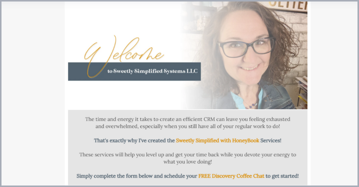
Building it doesn’t necessarily mean they’ll come. Make your contact form more appealing by including an introductory section with more context about your business. Identify your clients’ primary pain point, then share how you’ll solve their problem.
Before transitioning to your form questions, briefly explain why your services are the best option for their needs. Offering this context gives a clear call to action for your website visitors. They’ll know how and why your business will benefit them.
Your contact form introduction can also include a bit about who you are, letting potential clients see who they’ll be working with. Adding a bit of your personality will help introduce your brand and show clients who’s behind the contact form.
2. Include Pricing Right Off the Bat
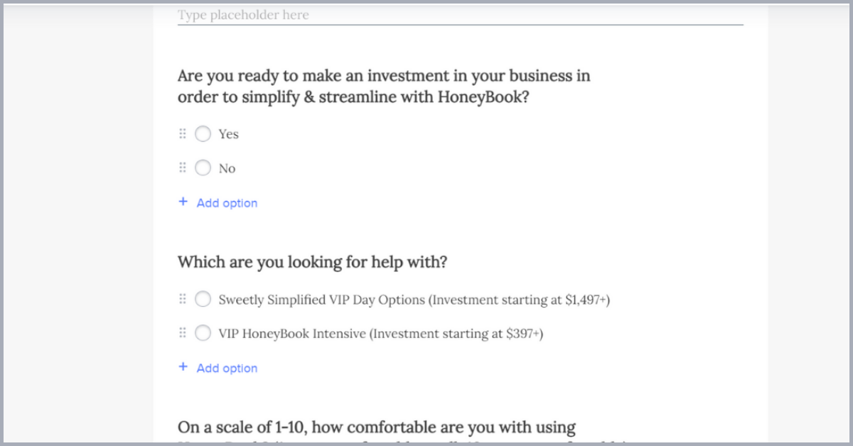
What’s the first question leads ask? It’s usually about pricing! By showing your leads what their investment will be upfront, you can save time you’d usually spend vetting clients for their budget.
In your contact form, ask a question like, “Are you ready to make an investment?” before leading into a list of your services and their cost. Adding this step in the contact form will improve your consultation or discovery calls by starting to determine if there’s a good client fit.
3. Include Next Steps
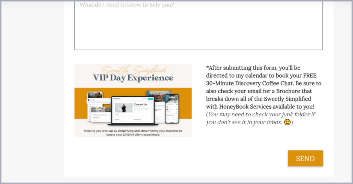
We’ve all been burned by contact forms online–inputting all our information only to never receive a response. To make it more likely that users will fill out their information, let them know what to expect afterward.
At the end of the form, include a brief section about next steps. State if you’ll be sending an email or if they’ll be redirected to a landing page or calendar. By setting these expectations, you can start to create an excellent client experience from your contact form.
Turn Your Contact Form Into a Lead-Generating Machine
With an optimized contact form, you’ll gain more leads while also saving time vetting them. The contact form is also a powerful tool to use in tandem with other HoneyBook features, such as the meeting scheduler and automations. With everything synced, you can communicate with leads more quickly and move them into your pipeline when they’re ready.
For more help, download Stacey’s free HoneyBook contact form template. Get started optimizing your contact form and generating new leads!
To learn from other systems strategists like Stacey, visit the HoneyBook Pros program. Expert entrepreneurs and business owners can teach you how to use your account to meet and exceed your specific business goals.
Work With Stacey to Increase Leads!
HoneyBook Pro Stacey Hooker can help you optimize your lead generation, growing your client base.
Contact Stacey
