Leave a 🙋♀️ in the comments if most days you’re scrambling for what to post on Instagram? With the algorithm prioritizing the most recent content you feel pressured to show up every day. But, you’re so busy building an empire (and life) that planning ahead falls off your list.
We get it.
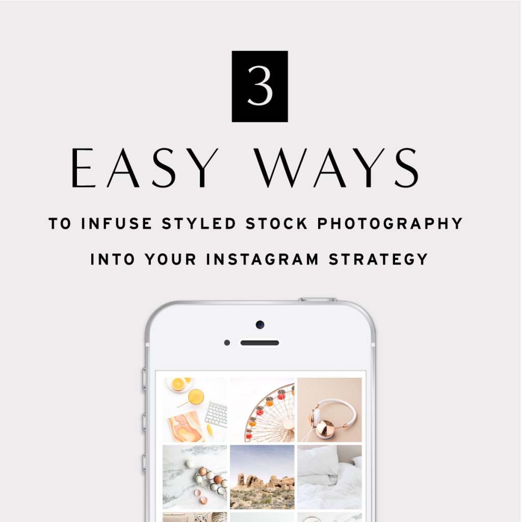
Planning an aesthetically pleasing content calendar can seem daunting but if there’s one thing we know, it’s how to make it easy…and fun with styled stock photography!
But why styled stock?
The number one reason to use styled stock in your brand is to increase your brand recognition and elevate your online presence.
It goes beyond a pretty feed – it’s about building an extension of your client experience that is professional, polished, valuable AND attractive.
Having quality content paired with killer captions that engage your audience will be rewarded in the algorithm. That’s just fact.
Today we’re sharing three super simple strategies for taking your Instagram feed from amateur to professional (plus a surprise!) you can implement right now to make it happen.
1. Start with your brand colors
The easiest way to bring cohesion to your Instagram grid is to showcase images that represent your brand colors.
Think beyond the feed: When someone clicks from your website through to your Insta profile to learn more about you and your business, those little squares should play well together with your branding. They should help tell your story. Make sure that the colors align, and choose an anchor color to tie them all in.
If you’ve ever wondered if colors play a role in how much engagement you get or the likelihood of someone double-tapping on your post, the short answer is, absolutely!
According to a study by Emerald Insights, 62-90% of our judgement is based on color. Understanding this data and applying it to Instagram marketing, Curalate found, out of 8 million photos analyzed, photos that featured blue tones performed 24% better than those with reds and oranges.
So interesting right!?
Now, that’s not to say you should stay away from every color except blue. It’s all about balance.
You have to understand what your tribe is into.
How? Explore the colors on your most liked image in the last 30 days.
Experiment through anchor color variations, and find the mix that works for you. Why the fuss about anchor colors? The study also found that single vs. multicolored images get 17% more likes.
Pro Tip: You don’t have to commit to one anchor color for life (unless you want to!). Rotate your anchor color each month to keep your feed fresh and interesting! This conditions people to come back and check out your new color story, which helps drive your overall reach and engagements. In both of our shops, SC Stockshop and Social Squares, you can easily sort by color helping to narrow down color choices in a snap.
To get a really good visual of the aesthetics of your grid and where there’s opportunity to leverage color, we recommend using a visual planning tool like Later. With Later, you can see more than just your top 9 squares all at once. That way you can get a feel for how it all looks together, and can select and rearrange images accordingly.

Follow here!
2. Play with composition for a balanced feed
The Rule of Thirds: Keep your subject in 1/3 of the photo, and negative space as the rest.
This is a great guideline to follow for the overall composition of a photo you select to post.
This same concept can be applied when you’re visualizing and planning for your entire grid. An asymmetrical composition is more pleasing to the eye. It looks more natural than one where the subject is placed right in the center.
A simple way to achieve visual balance and depth of field is to alternate posts between tightly cropped photos and those that have more white space.
If you use an iPhone, turn on “Grid” under camera settings to leverage this technique for your mobile photos.
Pro Tip: Most SC Stockshop images are such high resolution that they can be zoomed in and cropped endlessly. Crop down, spin, and invert different parts of a Stockshop image and use it as different variations. We have an awesome post that shows you how here. These images can also be used to create Stories content for a 360 cohesive look! Not sure what to use the images on Stories for? Try them as the perfect backdrop to share a quote, ask a question or poll and to announce new launches and promotions.

Follow here!
3. Plan ahead (there’s just no way around it!)
No more posting to your feed in the moment (that’s what Stories are for!).
There’s just no way around it.
The brands that are #winning the social media game are using planning apps to schedule strategic and engaging content weeks, even months, in advance. The only way to consistently drive business impact is if you get in the habit of planning ahead.
This makes it easier for you to get to your end result: a visually attractive (and valuable) Instagram feed serving loyal and engaged fans who turn into lifetime customers.
Among other things, scheduling ahead also ensures your content is seen and engaged with when your audience is actually online – not just when you get around to posting.
If you haven’t done so already, upgrade your Instagram Profile to a Business Account. This allows you to tap into Instagram Insights right on the app, and get an overview of when your audience is actively scrolling through the feed.
Creating consistency in your posting schedule not only increases content visibility, but it also helps establish authority in your niche. Consistency is one of the primary foundations of trust.
Pro Tip: Let us help you insert your brand into pop culture and current events. Never miss a #hashtagholiday, like ever. #NationalDonutDay? No problem! We’ve got a styled stock image for that! Participating in conversations relevant to your target audience boosts reach and engagement. It also exposes you to a new audience (that’s the point of #hashtags after all!).
Infusing beautiful imagery into your Instagram strategy to plan a visually pleasing and engaging content calendar is simpler than you think with styled stock subscriptions like Social Squares. And the best part is, no photography skill is needed! To help get you started, we’re giving you ONE FREE MONTH to the entire Social Squares library. Just download the Ultimate Guide to Instagram for Business and find the code inside.
Begin using our small business management platform to help you grow your business.
Ready to uplevel your Instagram strategy, connect with your audience, and build your brand? Get our Ultimate Guide to Instagram for Business.


