Last week I shared about the six basic types of fonts, and while it’s true that choosing the right fonts make a big difference in a design, it’s also important to know how to style those fonts. Understanding tracking, line height and font variations can take a basic design to an amazing design.
The majority of styling can be done through the Character window in Adobe Photoshop, Illustrator and InDesign, so that’s where we’re going to begin. Typography tools can be picked up with a little bit of practice.

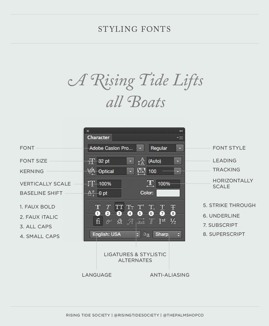
Font: I’m sure you’ve figured this one out by now, but this allows you to choose which font you’ll be using.
Font Size: Again, pretty easy to figure out.
Kerning: This is an important one because it controls the spacing between letters. For body copy and text that is displayed at a smaller size, I always set this to optical. If I’m creating a large headline and I notice weird gaps between the letters, I’ll place the cursor between two letters and adjust the spacing to make it even.
Vertically Scale: You should ignore this one! It can crunch or stretch fonts–trust me, fonts weren’t meant to be adjusted like this. If you use this tool, a type designer is crying somewhere in the universe.
Baseline Shift: This is another tool I don’t think I’ve ever used. It adjusts where a character sits within a line. So if you wanted the “e” in “peanut” to sit higher than the rest of the word, this is the tool that would do it.
Font Style: This allows you to select different variations of a font such as bold and italic. Some fonts also have thinner or thicker versions.
Leading (line height): This is one of my favorite settings to tweak. With larger fonts and shorter bits of text, it’s usually best to keep the leading at auto, or at a size close to the font size. This keeps the lines closer together and makes them feel like more of a unit.
But when you have a lot of text or you want something to feel more elegant, it’s good to increase the line height. For body copy set at a size 14 font, I like to set my line height to something around 22 – although this varies depending on the font.
Tracking: Tracking is another one of my favorite settings. I love adding a little bit of “breathing room” in between the characters – especially for headlines or type set in all caps. I wouldn’t set paragraph text above 50, but for single lines of text set in all caps – I’ve gone as high as 1000. The added spacing helps make text feel more elegant and “high end.”
Horizontally Scale: Like vertical scale, this is a tool you should avoid.
Faux Bold: This button makes a font bold but it doesn’t actually use the bold version of a font – which means that at certain sizes, characters might not appear as crisp. If a font has a bold version, it’s always best to use it. I only use this as a last resort.
Faux Italic: This is another button I try to avoid. The actual italic version of a font always looks much better. This shifts a font to display at the same angle as an italic font – which doesn’t always look too hot.
All Caps: I love using this button to experiment with trying a line or two of text in all caps. I use all caps for headlines and callouts. You never want to use caps for body copy or a paragraph of text because it’s way, way too difficult to read.
Small Caps: This button switches text to display in all text, but it makes the first character of a sentence a larger character. This is another button that I rarely use.
Strike Through: This button adds a line through text.
Underline: I never use this button. Back when we were first learning how to write papers we were told to underline titles, but today switching titles to italics is the standard.
Subscript: Subscripts are smaller characters that are dropped below the baseline. They’re often used for molecular formulas and math equations.
Superscript: Superscripts are smaller characters that are aligned with the top of the baseline. They’re sometimes used to show places like 1st, 2nd, 3rd, 4th. They can also be used to denote trademarks and copyright.
Ligatures These buttons are only available with better fonts. If you’re using a font that has a ligatures, I would turn them on. Using ligatures helps prevent letters from running together and becoming difficult to read. Swashes can be fun to play with too – although you may need to turn on the glyphs palette to really explore the variations.
Language: This button tells Photoshop which language you’re using. Although it would be cool if it could translate text, it’s used for spelling and hyphenation.
Anti-Aliasing: Anti-aliasing keeps the edges of letters looking smooth. Without any treatment, letters would look really sharp and blocky. I toggle between the different options to find the smoothest setting for the text I’m working with.


