Your primary logo and secondary logo are key to your brand, along with several other types of brand files. By understanding how to use each, you can ensure consistency and a strong visual identity.

The branding design process takes an extraordinary amount of time and effort. But when you’re done, it isn’t always clear what to do with all your logos, color palettes, font kits, design elements, and more.
When should you use your primary logo design versus your secondary logos? What’s the difference between web and high resolution? What if you need to use your logo over a photo? What then? What should you use for your social media profile images?
Learn what should go into your brand identity files and how to organize everything to make it easy to work with. This guide is perfect for independent business owners who’ve worked with a designer (or are planning to) or want to build their brand guidelines on their own.
Jump to:
- What goes into your brand identity files
- What’s the difference between a primary and secondary logo
- How to use your primary logo and secondary logo
- Implementing your brand throughout your clientflow
What goes into your brand identity files
Your branding package should include everything you need to incorporate branding on your website, social media profiles, advertising campaigns, print marketing, and more.
When it’s finished, you’ll have a series of files in a variety of different formats that work well for high-res web needs, editing, and print. Most importantly, you’ll have a primary logo and a secondary logo that you can work with.

Here are some of the main file types of common logo variations you should get in a design package after a rebrand or branding exercise:
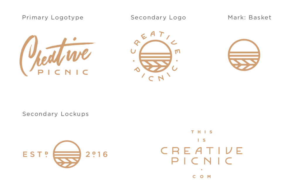
- Master logo – The master logo is the one with all the things. Usually, this one has additional elements like the date established, location, and/or other icons paired with the logo to make a special statement. This is your brand in all its glory, however, it shouldn’t be used most frequently. This type of lock-up is ideal for scenarios where it needs to make a big impression and has a decent amount of real estate to work with. Think signage, packaging, a postcard front, shopping bag, or brochure cover.
- Primary logo – The primary logo design is the MVP of your brand. This is a simplified version of the master logo, and it should be used most frequently, whenever space allows.
- Secondary logo – This is the more compact version of the logo you’ll use when the primary logo doesn’t fit or feel right in a chosen context. If your primary logo takes up more vertical real estate, maybe this one is more horizontal. This alternate logo still feels cohesive and at home with the rest of your identity, but is used on a more as-needed basis.
- Logotype – This term may apply to your primary and/or secondary logo, or your brand may not have one at all. Essentially “logotype” refers to a logo where the typography is the hero all on its own. Disney and Google are great examples of famous logotypes.
- Mark – The mark could be an icon/symbol that’s part of the primary and/or secondary logo, or it may stand on its own as a totally separate brand element. I tend to use the design mark to support the brand in places where the business name already appears (so as not to be repetitive) and/or where the full logo would be too large. Think social media avatar, website favicon, or one side of a business card. For some brands, the mark becomes a standalone element that’s so strong it can stand alone and still be recognizable (Apple and Nike for instance).
- Secondary marks – The secondary marks usually involve the mark and/or other supporting icons or text (date established, location, website, tagline, etc). These marks add an extra layer of depth to the brand and can be implemented in interesting and fun ways throughout your swag and collateral items.
The variation of the logo you use is essentially up to you. The brand guidelines should cover a host of other design decisions as well, including your brand color palette and typography. But we’ll save those topics for another day.
What’s the difference between a primary logo and a secondary logo?
A primary logo should be the mark you choose to represent your full brand. This logo will be the one you use most often, and will likely include all your primary brand colors and font. You’ll want to use this logo in the header of your website and the profile photos of your social media accounts as well.
The secondary logo is typically smaller than the primary logo, so it’s appropriate for situations where you can’t use the full primary logo. Some examples might include marking your social graphics or placing it in the footer of a print document.
How to use your primary logo and secondary logo
Now let’s take a look at some common branding usages you may consider using your logo and brand files, and I’ll let you know which ones to use.
I need a logo file for the header of my website
If your website header and background are white, you can use a web-resolution JPG. For colored or graphic backgrounds, use a PNG. It’s best to use your primary logo here, but you can also use your secondary logo if you have a primary logo that’s too large for your header.
I want to have my logo engraved on gifts for my clients
Anytime you’re having your logo engraved or etched on anything, this will require a vector file, like EPS or AI (Adobe Illustrator). If you’re printing your logo in color, be sure to also include the respective Pantone color.
I need a logo file for the top of my letterhead, formatted for Microsoft Word
A high-resolution JPG is your best bet here.
I want to add my brand icons to my website
If your website background is white, you can use web-resolution JPG files. For colored or graphic backgrounds, use PNG files.
I’m having my logo made into a laser-cut decal or sign
Laser-cutting, engraving, and signage require the precision of vector files.
I need to use my logo on purchase orders
Since these are usually printed in only one color, use a black and white high-resolution JPG file.
I need a logo file for my social media profile
A high-resolution JPG is your best bet here.
I’m making letterpress business cards. Which files do I use?
Letterpress, foil stamping, and other specialty print methods require vector files.
The logo on my website looks fuzzy on my phone and new laptop. What can I do?
This is because your phone and new monitor are retina displays, which double the number of pixels per inch. This makes for a really crisp web experience, but will also make graphics saved at 72ppi look fuzzy.
If your website’s on a site like Squarespace, simply upload a larger JPG or PNG file (essentially double the size of the original). Then you can scale it back down in your settings.
If you have a custom site or one where there’s a developer platform to make adjustments to your site, your best bet is to hire a web designer or developer to switch your website’s logo file and other fuzzy graphics to SVG files. These are vector files for the web, which are not supported by a lot of plug-and-play sites outside the developer platform and require a bit of coding to implement.
I’m using my logo on a print advertisement or postcard over a photograph, so it needs a transparent background
Do not use a png file here. They don’t have the proper color mode for print applications (CMYK). Vector files have a transparent background and will be the proper color mode for print applications like advertisement materials and collateral.
Implementing your brand throughout your clientflow
Once you have all your final brand identity files, it’s time to make sure you have a solid set of brand guidelines, which can also be called a style guide. The brand guidelines will include more instructions for how to use your visual assets, as well as messaging and voice guidelines. You can use these for your website copy, blog posts, and more.
Pulling everything together into guidelines is important to set your brand aesthetic, while providing guidance for yourself and your current or future team. Once you have your primary and secondary logo and other files, using them consistently is key, and having guidelines will support clarity regarding any digital applications of your brand design.
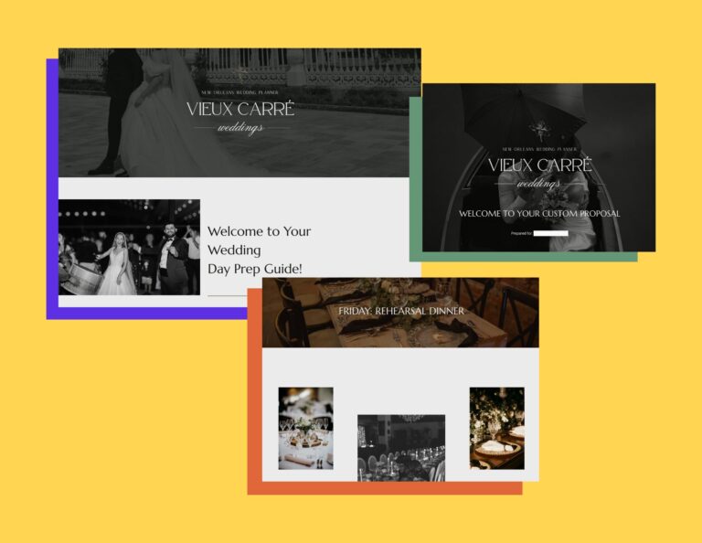
Within your guidelines, consider where you can use your brand throughout your clientflow. Beyond your website and marketing materials, can you add your primary logo to your invoice templates? You can also add your secondary logo within your Gmail signature. Using your brand files at client touchpoints maintains a more cohesive experience, from discovery to booking and beyond.

Use HoneyBook to manage all of your client communication in one place.


