Linktree bounced into our creative entrepreneurial periphery Tigger-style a few months ago: but when it comes to how to use Linktree well in your Instagram strategy, you may be bottlenecking your conversions.
Today, we’re going to make sure you turbo-charge that Instagram conversion funnel, starting with that “link in bio” piece—your Linktree or bio link.
Pre-Linktree, we were stuck choosing the main driving link for our Instagram bio: do we shoot them towards our website? Our last blog post? Our most-watched YouTube video, or a link to a specific event like a webinar?
But along came Linktree, a game changer that pre-optimized our Instagram landing pages for mobile and leveraged whitespace, all packaged up in a simplified user experience.
Today, I want to make sure you’re not using it wrong. You’ll learn:
- The psychological piece you may not be taking into account
- How to write copy for those call-to-action buttons
- 2 ways to fix your Linktree and call-to-action buttons today

How to set up your LinkTree
Linktree is a tool that turns your one bio link on Instagram into a hub for more links. Instead of constantly editing your profile to change your bio link, you can use a Linktree URL to link to multiple pages. Ultimately, this helps you drive conversion from social media to the pages that matter most to you.
For example, let’s say you want to link to your main business website and let your followers know when they can book a meeting with you. Here’s how you would do that:
- Create your Linktree account at linktr.ee
- Select “Get Started for Free” and register (later, you will pick your plan – either their free version or a paid monthly subscription).
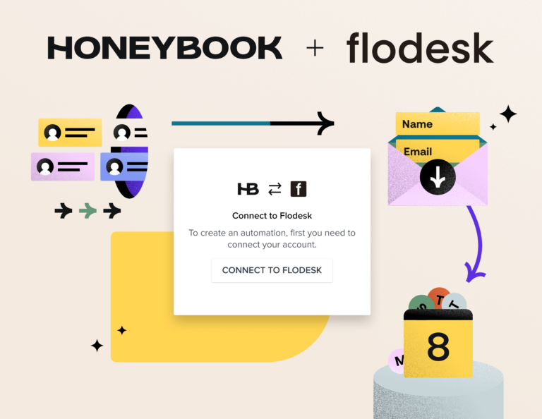
- Create your account and set it up. In this case, you would add a link to your website and to HoneyBook’s online meeting scheduler. This calendar allows you to set your availability and share your link so that potential clients can find a time that works for you and for them. This makes it much easier for them to book you.
- Now that you have your Linktree account up and running, add it to your Instagram. Copy the link to your Linktree and then open your Instagram account profile. Once there, select “edit profile” and paste the link into “website.” Select “done” in the upper right corner and you’re set!
- Your Linktree is now featured in your Instagram bio, which means that your followers can easily find your website and availability (or whatever else you want them to know).
Now that you know how it works, it’s time for you to learn how many links to add – and the psychology behind it.
The issue with multiple links
There’s a beloved (well, by marketers, at least) study on the paradox of choice. It’d be almost college age if it were a person, but as one of my favorite old (dead) copywriters says, “Human nature is perpetual. In most respects, it is the same today as in the time of Caesar”—so it’s a 2000 study that’s every bit as pertinent today.
In the study, psychologists displayed 24 varieties of gourmet jam at a grocery store, telling shoppers that if they just sampled a jam, a freshly minted coupon would be theirs. A few days later, they tested the same deal—but in lieu of 24 jams, simply showed 6.
Betcha can guess what happened.
The shoppers presented with 24 jams were one-tenth as likely to head to the cash register with a jam … the ones who sampled from the selection of 6 ended up purchasing more.
“Too many choices can overwhelm us and cause us to not choose at all,” psychologist Sheena Iyengar concluded. “For businesses, this means that if they offer us too many choices, we may not buy anything.”
Psychologists further concluded that more options also “lead us to be less, not more satisfied once we actually decide … there’s often that nagging feeling that we could have done better.” (You can head to Harvard Business Review to read more about the study.)
Fascinating.
Here’s the thing: the science of marketing looks at buying psychology, and—by default—what gets your reader to take the desired action. While it’s SO natural to think you’re spoiling your dear reader with a bevy of choices, ways to engage, and new information (Follow me here! Subscribe for more tips! Here are 3 current promos! Check out my free audit page! Get your ebook!), the whole point of a CTA button is to give your visitors a single action to take.
It’s paramount to give your readers a single, certain path to follow towards a conversion … otherwise, we risk losing them in transit. Analysis paralysis.
I see a lot of creatives having 4, 5, 6+ CTAs in their Instagram Linktree landing page, but asking your reader to complete multiple actions can lead to decreased conversion. If you’re asking me to download your freebie, read your blog, send you an email, peruse the shop, and find you on Facebook, I’m already overwhelmed.
I tell my Copywriting for Creatives students to always have one goal for every landing page, every email, and every page of website copy they draft: one goal, one reader, one offer. So, when a reader hops aboard your website, the goal isn’t to overload them with a crazy amount of to-do’s and content. It’s to shepherd them towards the next step in their customer journey, and compel them to take ONE desired action.
Don’t give too many messages, don’t steer your potential clients in 500 directions—just coach them to the next step in the conversion process. There’s no magic number, but instead of starting to add as many links as you can think of, I’d recommend trimming your Linktree down to three buttons or less.
How to write the CTA copy
Okay, so now we’re tracking on why you need to slim down your CTA button count, let’s talk button copy.
Your Linktree or landing page call-to-action text needs to be clear—not clever. Watch your digital habits, and notice how many times you appreciate when a button is clear as a bell: Start My Free Trial, Get My Download Now, Search Notes. Bossy, authoritative copy just WORKS when it comes to CTAs.
Your CTA copy needs to be simple enough to understand in mere nanoseconds.
Want to amp it up a bit? Pepper in attention-getting, emotion-triggering copy keywords like “get” (actually a really good one), “my,” “free,” “instant,” “today,” and “now.”
Test out first person versus third person or urgent-sounding copy versus more evergreen-sounding copy. Rewrite it to focus on what your reader gets as far as benefits (ex. For a freebie to getting consistent in your photography workflow, try “Yes! Take my best photos yet!” instead of “Get free guide”). Easy way to do this? Think of it as an action statement for your reader, and kick the sentence off with “I want to … “ before you write it.
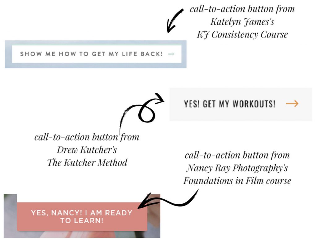
Here are a few stud CTA button examples from recent client work I’ve drafted:

Two more quick-fix tips
You’re primed up on the psychology and copy hacks of CTAs for your Linktree (… well, and for your website in general!), so let’s work together through the final step in the equation: How do you use Linktree in a way that actually works?
First, know your main goal.
Whatever your quarterly focus is or chief goal is, work to *not* overshadow that goal with cloudy, nebulous little baby goals. Keep the main thing the main thing. Once you’ve decided on what the biggest conversion you need during a time period is, use your Linktree CTAs to drive people toward that specific funnel. Maybe you’ve just started up an email list and need people on it … or just want to grow your list in general. Maybe you’ve got copious amounts of winter spots to fill, and each of your 2-3 Linktree links needs to lead people to an easy next step, like a freebie download, your free consult call link, and your gallery. Decide on your goal, trim links accordingly.
Next, test, tweak, and repeat.
When I worked in marketing for Delta Air Lines a few years back, we were constantly running A/B split tests on our SkyMiles and Delta customer audiences, from CTA button copy in an email to the email subject line itself. A/B testing is easier than it sounds … essentially, you tweak ONE (just one! That’s important.) element in your marketing collateral, and test it against the original to see who wins.
You may want to test your: CTA button copy, colors of buttons, types of conversions, and more.
Honestly, the easiest way I’ve found to do this isn’t Linktree (sorry, LT!), but with LeadPages. I created my own page just for my Instagram audience (so I can measure the hits it gets in Google Analytics), and created the buttons in Leadpages.
The bottom line: Use Linktree to convert clients
Failure to capitalize on the audience that clicks your “link in bio” on Instagram can be a root cause for many of your conversion problems. Having an appealing, classy, and clear Linktree CTA selection (or CTA buttons on your website in general!) is one of the best conversion secrets you can rev up in your creative business.


