When it comes to your website, you probably already know how important it is to have one. What you might not realize is how important it is to make it actionable through intentional design.
What’s even scarier to me, is this stat:
57% of internet users say they won’t recommend a business with a poorly designed website.
That’s kind of scary, right?
But it doesn’t have to be. Your website can be a strategic part of your business with a bit of intention.
1. Don’t Forget What 70% of These Other Small Businesses Did
One of the most important things about your website is to include a call to action. Have your visitors do something. This might seem obvious, but when I looked into it, 70% of websites for small businesses lack a call to action.
So, what is your call to action?
That’s something for you to think about, but here are some suggestions:
- Join over 2,000 creatives in my Facebook community
- Subscribe to my newsletter
- Contact me for more information
2. Put Your Contact Form to Work
Linking to your HoneyBook contact form is a great call to action. To get the most out if it, just be sure to:
- Place it at the top of the page. Because that’s what people are looking for when they come to your site. You can include it in other places as well, but add it to the top of the navigation so it’s always accessible.
- Be intentional about required fields. Every time you add a field, it diminishes the amount of people that are actually going to fill it out. So you have to weigh very carefully which things you actually want on the contact form. The fields I love to include are: name, email, how did you hear about us and send me a message.
- Include two methods of contact. People don’t always want to fill out forms, so give them a fallback like an email address to contact you.
- Set expectations. What is your response time? What will you get back to them with?
- Add a picture. Add a picture of you or your team on your contact form. Why is that important? Because it gives visitors a face of who they’re talking to.
- Ask “How did you hear about this?” This gives you a lot of information. This is context. For example, is this inquiry from a random search engine result or a friend of a friend? This information helps inform what the appropriate follow up is going to be, based on how they heard about you.
Want to try HoneyBook contact forms?
The HoneyBook contact form embeds right into your website. See how you can set up an automation to respond to your inquiry ASAP (and even send automated follow-up emails if they don’t respond!). Start free trial
Start free trial3. Use F Shapes
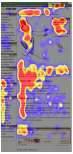
Next, make sure your site is optimized for how people in Western civilizations read websites. If you’re looking at your website, you’re probably thinking about it from left to right, top to bottom, left to right. This is how we read a book.
But studies show what our eyes look like when reading a website, and it actually looks like this.

The red parts are areas that you focus on the most, down to yellow and then blues with the least focus. This is what people are looking at on a web page.
When you look at your own website and what kind of content you have there, do you actually follow some kind of F-shape pattern that is going to pull visitors in quickly?
Look at your site, especially your homepage, through that lens.
4. Make It Mobile Friendly
When you’re designing for mobile, you’re going to have to think about a couple things. People bounce pretty quickly on mobile. You probably have experienced that yourself. You’re looking for information on your mobile phone, you find it, you go.
The good news is that 88% of people call or visit within 24 hours when they view a website on mobile.
Most people take action when they’re on a mobile device faster than they would on desktop. So make sure that your mobile site has those calls to action that are very appropriate for mobile devices: send me a text message, DM me on Instagram, or whatever it is.
5. If at First You Don’t Succeed, Follow-Up 5-12 More Times
The last tip for an actionable website is to have a plan around follow-up. The stats on this one are crazy.
44% of small businesses will give up after one contact.
Let’s say you get a lead, you send a message, you never hear back from them, and you think, “Oh, I never heard back from that person.” Almost half of small businesses stop right there. That one-time, that’s all they’re going to try.
10% will make more than three contacts.
That’s three attempts to return a follow-up with a customer after that person contacts them.
And here’s the great one:
80% of sales close between 5 and 12 follow-up contacts.
That means 90% of small businesses miss out on 80% of where sales happen.
We need to think about follow-up really intentionally. Because one time is not enough. Three times isn’t great, either. You need to have at least 5 to 12 touchpoints. Which is why it’s so important to make your plan for follow-up because otherwise, it just doesn’t happen.
Use automated tools to help you:
- HoneyBook has great tools for automated follow-up. You can build workflows where you can have 10 scheduled emails to follow up. That’s going to be the most important thing you ever do, once you actually get a lead.
- Flodesk is another one that I would recommend for email marketing. (Pro Tip: See how HoneyBook and Flodesk work together to grow your business.)
- Text. A lot of people say, “I sent an email, it’s going to work out.” I don’t know how many emails I get, but it’s a lot, and I don’t respond to all the emails. If you think your only way to run a business is through email, that’s not how the whole world works. So think about how we actually use other tools that are out there. Ask for a phone number and text them. Use things that you know are channels that people are more likely to respond to.
- Facebook Messenger. Facebook has a new Messenger integration. So you can put a little button on your site to message me through Facebook, someone just messages you, it will respond automatically for you and you can build up workflows with that as well. The open rates on Facebook Messenger are still super high, it’s almost like text messaging. If you can look at your plans and integrate Facebook Messenger, it’s really good for follow-up.
And remember, don’t be like those stats up there. Don’t give up. Keep following up, and make that’s part of your process. Be intentional with your calls to action, especially when optimizing your contact form, and design your website in a way that reflects your brand and how people consume your content (hint: less is more on mobile!). You’ll be on your way to an action-packed website in no time!


