After working closely with freelancers (and freelancing myself) for over a decade, there’s one thing nearly all of us freelancers agree on:
You’ve really got to rock your portfolio.
It’s a no-brainer. Having a well-thought-out portfolio can lead to insane amounts of new clients, fun collaborations, added awareness about your services, and other creative opportunities.
Smart freelancers focus on building a portfolio they can leverage to build their business.
Which is why I’m routinely shocked when a freelancer tells me their portfolio is “under construction” or that it “needs an update before I send it to any new potential clients.”
What? That’s insane.
After years of pulling my hair out, I realized what’s causing the big problem here. I think I have finally figured out why so many of us freelancers say we believe in the importance of portfolios but we neglect them anyway.
Why is it?
Because most freelancers—yes, probably you too; I know I used to—think about portfolios completely wrong.
Your portfolio isn’t the place to show off your best work or even your most recent work. Its job is not to grow your Instagram following or blog readers.
No, the singular job of your portfolio should be to bring in more clients. And that’s exactly where I can help.
Why you shouldn’t skim this article
If your portfolio already brings in so much new business every month that you don’t know what to do, then you should just click the back button right now.
But if you’re tired of your portfolio being an afterthought, a waste of time and effort, a sad wasteland of no visitors and certainly no new business, then stay tuned.
If you’re tired of hunting down the best freelance jobs only to have potential clients take a look at your portfolio and mysteriously decline your pitch, keep reading.
This article is for you.
Below, I’ll share with you the basics of building (or rebuilding) a portfolio that’s optimized to convert site visitors into paying clients and raving fans.
The tactics I’ll share are based not only on over 10 years working with freelancers in my community but also come from years working as a professional salesman and marketer—converting tens of thousands of customers for my employer or myself on a regular basis.
I’ll share with you the top mistakes I’ve seen after countless freelance portfolio critiques so you don’t fall into the same common traps everyone else does.
More than anything, I’ll help you think more like marketing pro—not the slimy, salesy, pushy kind, but as someone who knows exactly what your customer wants and then builds a brand that speaks with passion about solving your clients’ biggest problems.
I’ll show you how to build a portfolio that converts and how to measure and track your conversions using HoneyBook.
When we’re done, you’ll have everything you need to build a portfolio optimized for massive client conversions.
Here we go!
Changing how you think about your portfolio will change everything
Before we dive too deep into the tactical steps you should take when building or rebuilding your freelance portfolio, you have to change how you think about your portfolio in the first place.
As I mentioned previously: your portfolio is not a place to show off your greatest work.
It’s not a place to brag about your awards.
It’s not even a place to highlight what your previous clients have said about you.
Sure all of those things can be included—that’s not a problem.
But it’s how you include them that makes all the difference.
Most freelancers make the enormous mistake of thinking their portfolio is all about them.
You show off your best work. You brag about your best work. You post the best testimonials about you.
Here’s a bit of a harsh newsflash though: Your portfolio is NOT about you.
Your portfolio, in reality, should have one job and one job only: to bring you new clients.
There are plenty of other places to show off, boost your ego, and show your creative process (Instagram is fantastic for this).
Every decision you make as we walk through the portfolio-optimization process below should be prefaced with this question:
Does this increase or decrease the likelihood that a site visitor will convert into a paying client?
Answers to questions about common portfolio mistakes (like adding social media buttons—more to come on that) might take you by surprise.
Notice I didn’t say you should ask: Does this increase the likelihood my client will think I’m amazing? Or Will this improve my chances of getting more blog subscribers?
You must be focused on just one thing: client conversions.
It’s not that including testimonials, adding social media buttons, starting a blog or featuring giant images of your best work are inherently bad.
But they’re not inherently good, either. Just because every other creative in your industry includes them in their portfolio, doesn’t mean you should too. Keep reading the article and I’ll explain exactly why.
With that, let’s get into the actual tactics of a high-converting portfolio site.
Start with a minimum viable portfolio
To borrow a phrase from the world of startups, you should aim to start with a minimum-viable portfolio.
That is to say: you should attempt to build a portfolio that requires a minimum amount of work while proving that, when you drive visitors to it, it will convert to new clients.
In the world of technology development, a minimum viable product is (MVP) is a product with just enough features to satisfy early customers, and to provide feedback for future product development.
In the world of portfolios, a minimum viable portfolio (ahem…MVP) is a portfolio with just enough content to convince early clients to hire you and to provide feedback you need to improve your portfolio in the future.
The biggest reason you should strive for an MVP is efficiency.
The last thing you want to do (and unfortunately SO many freelancers do this) is waste months of brainstorming, collecting projects, uploading, creating a website, tweaking everything….and tweaking it again… all before any potential clients have a chance to use it.
Instead, your goal should be to put up a simple, yet professional site that aims to convert. Then, you’ll send it to a pool of potential clients and see what happens.
You’ll learn far more by putting it out into the real world and gathering feedback (both from individual human beings and from data tools like Google Analytics) than you ever will by creating for months on end in a vacuum.
What does an MVP look like realistically?
Ok. All this theory is fine for dinner conversation. But what about actually implementing this idea of a minimum viable portfolio in the real world?
Here’s what it might look like for you:
Consolidated pages
Instead of building a large, 10-page website complete with a robust “about me” page, “contact us” page, “our services” page and all the other traditional pages, consider starting with just one page.
Yes. Only one.
There are quite a few advantages to consolidating your MVP on to one page.
For starters, it means a lot less work on your end which means you get a portfolio out into the world more quickly and can start bringing in potential clients sooner.
More importantly, it also means you can control the journey your site visitors take once they land on your homepage. Instead of crossing your fingers and hoping a site visitor reads your about page, then reviews your projects, and then finally clicks the contact page, you can control exactly what the client sees and in what order.
To polish off the full experience, you can include a chatbox, phone number, or contact form at the very end to lead them to the most important step: contacting you for hire.
Pro Tip: HoneyBook allows you to create a contact form you can embed directly on your page. This contact form eliminates the in-between step of receiving an inquiry and inputting information into CRM. Plus, if you avoid these contact form mistakes, you’ll convert more of the right kind of visitors in no time.
Consolidated projects
Moving from a multi-page portfolio to a one-page portfolio also means you’ll need to consolidate the number of projects you include on your site.
This is actually a good thing.
In a minimum viable portfolio, you don’t need more than 3-4 solid projects with sales-focused descriptions (more on that below) in order to convert a site visitor into a client.
Consolidating your work forces you to only choose (not the best, remember, but) the most likely-to-convert projects in your archives.
If it doesn’t lend itself to convincing someone to hire you, leave it out.
Use emotion to speak your client’s language
Having a minimum viable portfolio isn’t enough to convince site visitors to actually hire you, though.
You’ve got to use the right kinds of words on your portfolio site.
Remember, this site is not about you. Avoid writing sentences like “I take life-changing photographs.” Instead, use words that put a potential client at ease and answer the question “is this the right freelancer for me?”
Here are a few examples:
Speaking about you (bad):
- I design brand logos that are memorable and beautiful.
- I take pictures that last a lifetime.
- I write articles that rank in the Google top 10.
Speaking your client’s language (good):
- Your customers already love you—they should love your brand too.
- Enjoy your once-in-a-lifetime day. Then remember it forever with the perfect photos.
- Your customers are searching for answers you have. Rank where they can find you.
Notice how the second round of headlines has almost nothing to do with the freelancer in question and everything to do with the client’s needs.
In the words of Seth Godin, one of the greatest marketers of our time, “People do not buy goods and services. They buy relations, stories, and magic.”
When you’re focused on selling your services (photography, design, writing, etc.) it can be hard to zoom out and identify what stories or magic might motivate a site visitor to hire you.
But the more you can appeal to a clients’ emotions, the better chance you have of getting hired.
Consider a few emotions your potential clients might be feeling and the corresponding emotion you can appeal to with your freelancing services.
| What your client is feeling | What you should be selling |
| Overwhelm Your client has too many things to do and feels overwhelmed at the idea of doing more. |
Relief Hiring you means one less thing they’ll need to personally get done or worry about. |
| Insecurity Your client has an important project or event that needs a professional touch. They’re unsure if they’re qualified for the task at hand. |
Confidence Hiring you means your client can be confident the project will be completed on time and professionally. |
| Pressure Tight deadlines on a big project mean your client is feeling real pressure to deliver a quality project by a certain deadline. |
Excitement Hiring you means your client can trade some of their anxiety caused by pressure for excitement to see the project come to fruition. |
You can (and should) mimic the examples above for your own situation. Start by identifying the the biggest pain points your potential clients are feeling.
Next, identify the corresponding positive emotion (right column above) they’d like to have their negative emotion (left column above) replaced with.
You should then use positive emotions to direct the writing on your website.
To quote another renown salesman of our time, Zig Ziglar: “People don’t buy for logical reasons. They buy for emotional reasons.”
Your goal must become to give them the emotional reasoning they need to hire you quickly.
Of course, none of what we’ve discussed so far is helpful unless you make it extremely easy for clients to take action on your site. Which is where the final section of this article comes in.
Make it extremely easy for someone to take the next step
Okay. You’ve built your minimum viable portfolio. You’ve added in emotion-driven copy to entice site visitors to hire you (or at least learn more about your services).
But you’ll still not see the kinds of results you want unless you work hard to make it as easy as possible for someone to take the next step toward hiring you.
In order to do that, here are a few suggestions:
Remove all dead-ends
One of the biggest killers of conversion rates (the rate at which site visitors turn into paying clients) may very well be the dreaded “dead-end”.
This often happens when you have photo galleries or detail pages in your portfolio that, while they do offer nice details on each project, they fail to move your client to the next step in their journey to becoming a paying customer.
When a user finds themselves at the end of a site journey, the likelihood they’ll click the “back” button, close the window, or just get frustrated increase exponentially.
To remedy that, remember to first reduce your pages where possible. As a reminder, this helps you control the customer journey a bit more.
In addition, ensure every single page on your site has a clear call-to-action guiding the user toward hiring you. This can be a link (or multiple links) that might look something like this:
Like what you see? Click here to see how we can capture your perfect day.
Alternately, you might choose more direct options on some pages like a large “hire me” or “contact me” button.
Whatever you choose, make sure it’s clear, obvious, and easy to take action on. Don’t make people guess what might happen if they click your link or button.
Remove all off-ramps
In addition to removing all dead-ends from your site, you should consider removing any off-ramps that might take a visitor away from your portfolio site.
And, yes, I mean ANY.
There are obvious off-ramps like banner ads or links to studies or articles.
I believe the more harmful off-ramps are the ones that have become so widely used on portfolio sites around the web, we don’t think twice before adding them to our own.
Those include social media icons, links to client work, or links to your own blog.
Remember way back to the beginning of this article where I encouraged you to ask this question:
Does this increase or decrease the likelihood that a site visitor will convert into a paying client?
While growing an Instagram following or starting a blog can be helpful in growing your business, it should NOT be the primary goal of your portfolio site.
Why?
When was the last time you were on Instagram for example? Sites like Instagram, Facebook, or Pinterest are highly engineered to KEEP users on their site.
Once you’ve sent a potential client back to Instagram (instead of deeper into your portfolio site) you might as well say goodbye to their business. The odds that they’ll ever make it back are pretty slim.
I recommend you remove any external links and replace them with calls-to-action leading to your contact page, phone number, or chat box.
Don’t make people wonder how to contact you
The last thing you want is for a potential client to be sold on hiring you only to be frustrated with the lack of ease in actually contacting you.
You might think that putting a “mailto:” link or simply typing out your email address or phone number is enough. I recommend you take it a step further.
Your goal should be for clients to contact you in less than 30 seconds and 2 clicks or less.
That means if a site visitor is on the homepage (or any page, really) they should be able to click once to your contact page (if you even have the pages separated out) and then one more time to send their message.
Don’t make users copy/paste your email address into their email client, write a subject line, and click send.
It may not sound like a lot of work, but building a successful online portfolio means understanding how people use the Internet. The truth is, people are lazy. They’re busy. They want things handed to them.
If you choose to go with a contact form, make it simple. Don’t use your contact form to “filter out bad clients” until you’re just getting so many requests on a daily basis that you can’t handle it.
I recommend the following fields in your contact form:
Name: Let the user choose first, last, or full. What matters here is getting them to submit the form.
Email address: This one’s pretty straightforward. Don’t try things you’ve seen like “your best email” or “your work email.” Let people put whatever they want here without thinking too much about it.
Message: Finally, the message. You might want to add a couple of prompts to help users know what to write here. If not, keeping it simple is fine too.
That’s it?
Yep. You don’t need to know their budget yet. You don’t need to have them come up with a subject line. You don’t need to know much more about them.
The goal is to initiate the conversation and get the person’s contact information (email) so you can continue in a dialogue and ultimately book them as a client.
Bonus field: The only additional field I would recommend for later testing might be the “how did you hear about me?” field. However, I would keep it optional so users aren’t frustrated if they don’t remember. And if possible, set it to “I don’t remember.”
To simplify all of this, try using the HoneyBook contact form builder which allows you to customize the form to your liking. From there, you can embed the HoneyBook contact form on your site no matter what it’s built on.
The reason I’m okay with adding this bonus field is because it will come in handy during the final recommendation I’ll make below: testing and adjusting.
Test, get feedback, and adjust
Remember, the goal of your MVP (minimum viable portfolio) is to get it out there quickly, collect feedback, and optimize for massive client conversions.
Here are a few ways I recommend you test your new portfolio site:
Qualitative testing with friends, family, colleagues
Before sending the new portfolio to any potential clients, your goal should be to remove any glaring errors or mistakes. This can be accomplished using friends, family, colleagues, or even current clients who you trust.
Avoid asking vague, open-ended questions like “what do you think of my new portfolio?” though, since that won’t help you at all.
Instead, try sitting them down at a computer and asking them to type in your URL, visit the site and attempt to hire you.
Then watch.
Don’t talk. Don’t help them. Watch over their shoulder and just observe.
You’re likely to see spots where many people get confused, hung-up, lost, frustrated, or distracted. This will give you a nice list of initial adjustments you can make.
Quantitative testing with Honeybook and Google Analytics
Though the one-on-one testing with people you trust can be extremely insightful, getting more visitors to the site and watching the data on the back-end can offer a whole different grouping of realizations.
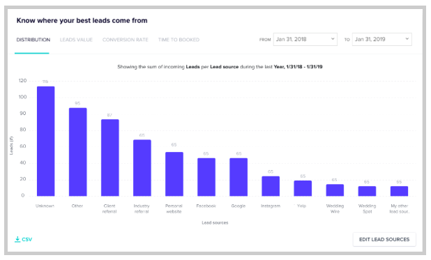
Using HoneyBook’s contact form and accompanying reports, you can see where your clients are coming from. Did they first see you on Instagram? Here about you on a podcast? Find your business on Yelp?
HoneyBook’s lead report can tell you. Here’s an example of what it might look like:

In addition, you might want to use a free tool like Google Analytics to see where site visitors are coming from, which pages they visit first, which pages they leave from, and the paths they take through your site to ultimately contact you (or leave).
Finally, if you’re building a one-page portfolio site, you may want to consider a heatmap tool like HotJar, which is also free. HotJar will show you how far down the page users typically scroll, where they click, and how they use your site.
You’re never done testing
If you’re serious about getting more clients from your online portfolio, here’s the reality of it: you’re never done testing.
I once had someone tell me they made small adjustments every week to their portfolio and it only increased their conversion rates by around 1% each time.
But over the course of 6—12 months, you can imagine what an impact all the testing and adjusting can have.
Increasing your conversion rate by even just 25% (which is modest and completely attainable) means if less effort and cost to bring in new clients with the exact same tool.
As you practice, learn, study and test, you’ll get better at it. You’ll start to learn what your clients are looking for, where they’re getting stuck and how to best help them.
Taking action is the only road to success
This article is over 3,500 words long. If you’ve made it this far, congratulations. You’re among the few who have.
But reading three thousand words on a topic means nothing if you don’t take action. So, to recap, here are the actions I recommend you take in the coming months to optimize your portfolio site for massive conversions:
- Retrain your brain to think of your portfolio as a sales tool instead of a fancy place to show off work.
- Create a minimum viable portfolio that meets the basic needs and avoids too many bells and whistles (for now).
- Speak your client’s language by identifying emotions they are feeling and how you can solve their biggest pain points.
- Make it extremely easy for clients to hire you by addressing dead-ends, off-ramps, and distractions.
- Begin testing your MVP as soon as possible (it doesn’t have to be perfect) and gather feedback quickly using real human beings and software like HoneyBook.
Last of all, some words of encouragement. Many of the freelancers I talk to about portfolios claim they just don’t have the time or energy (or they find they’re too picky about their own brand) to build or rebuild their portfolio.
But you’ve got this.
Optimizing your portfolio can be one of the most impactful things you can do for your freelance business.
I’d love to hear and see what changes you make to your portfolio after reading this article. You can find me on Twitter where you can ask me any follow-up questions or show of your (un)fancy new MVP.
I can’t wait to see what you come up with.


