A good contact form is a key to long-term lead generation for your business. To use them effectively, explore these five contact form examples and use our best practices.

The most underutilized element on a website is the contact form. You might have one, but maybe you haven’t spent a lot of time thinking about where to place it or what fields to include. Most business owners don’t realize the massive potential for lead generation that a contact form possesses.
Contact forms give potential customers a gateway to your business to ask further questions that could help when deciding to buy. While they’re getting value from communicating with you, you can learn more about them and evaluate if they’re a good fit. Without a contact form, none of this is possible.
Learn the best tips to create a contact form that stands out and use our examples of different types for your website and marketing channels.
Jump To:
- Why your business needs a contact form
- Examples of the effective contact forms
- General contact form
- Service landing page contact form
- Downloadable content contact form
- Contact form for social media followers
- Support contact form
- Tips for making a great contact form
- Building your contact forms
- Generating leads with contact forms
Why your business needs a contact form
Your business’s potential customers won’t always get all the information they need from your marketing materials or website. They’ll often have additional questions to ask about your services and how you can support their needs.
If you’re a business consultant, your leads might be wondering if you’ve ever worked in their industry before or what your customer service abilities are.
A website contact page provides a space for these questions so that potential clients can ask what they need and get answers that help convert them into paying customers.
In this way, a contact form can act as a lead-generation tool for businesses. It allows you to capture information about people who are interested enough in your business to take action.
In order to make a form that allows people to get in touch with you successfully, you’ll need to use the best tips on creating forms, sharing them, and leveraging them.
Pro tip
Want your contact forms to do even more? Use HoneyBook lead forms to capture information, qualify, and book clients–all from your public channels.
Compelling contact form examples for your independent business
Making the best website contact form isn’t going to be easy if you’ve never actually seen a well-executed version. To give you the best chance at creating an engaging form, here are some of the best website contact form templates.
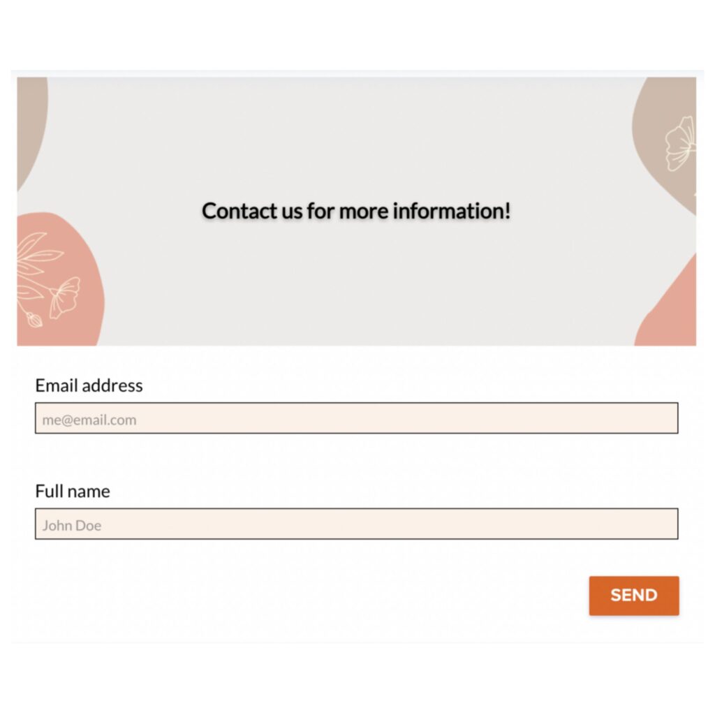
1. General contact form
The most basic way to get a lead’s contact information is to include a general contact form on your website. This can be as simple as a name and email field, or you can get more detailed by asking for their phone number, budget, or timeline.
This type of contact form is most effective when placed in an easily accessible spot on your website like a unique page linked to the footer or sidebar. That way, no matter where someone is on your website they can easily get in touch with you if they’re interested.
With a general contact form, you probably want to keep it simple with fields for an email address, name, and phone number. Though if you’d like to collect more information at this stage, you can also ask about their needs or what types of projects they’re interested in.

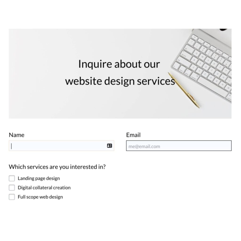
2. Service landing page contact form
If you have different services, it’s best practice to add a contact form on each of your service pages. That way, your leads can easily get in touch with you while they’re already researching your specific services, versus having to search for your general contact page.
What makes this type of contact form powerful is the ability to include specific fields for all the different types of services you offer.
For example, imagine you’re a website designer who offers two services: one for a complete website design and another for a single-page design. On your service page for a complete website design, you can ask questions about how many pages they want, what their budget is, how many images they have, etc. On the service page for a single-page design, you can ask what their timeline is, what type of page it is, and what conversion goals they have.
This level of specificity not only allows you to qualify leads better but also helps the lead feel like you’re considering their specific needs right off the bat. They’re more likely to trust your business and move forward with becoming a client.

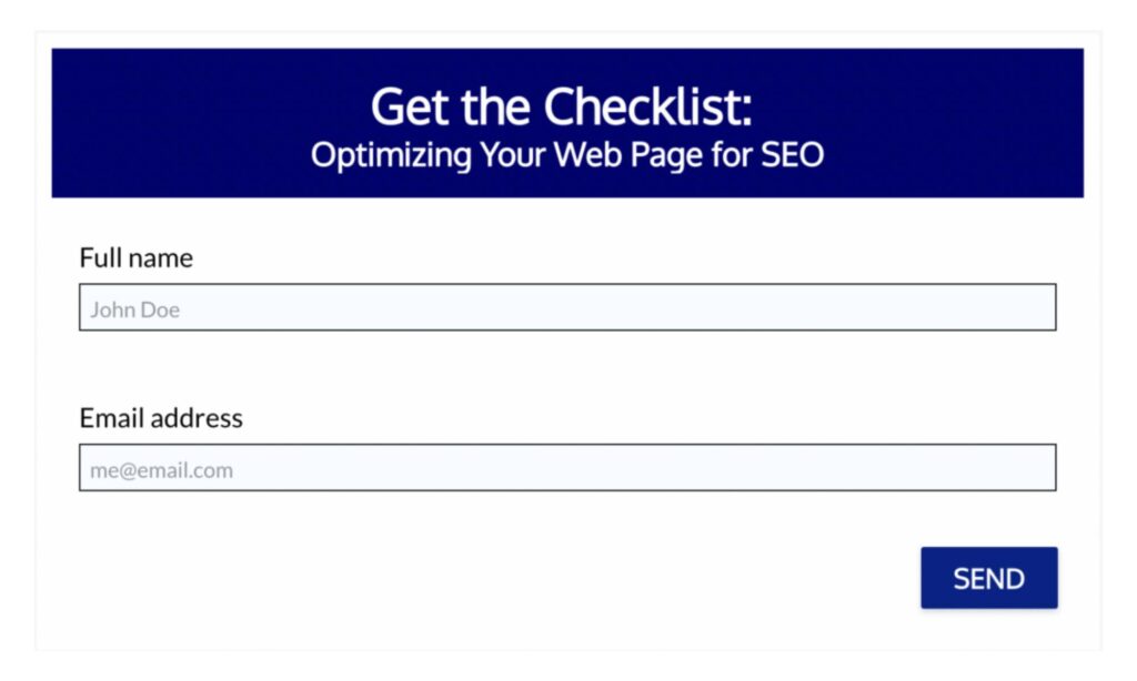
3. Downloadable content contact form
Another popular method of generating leads is creating downloadable resources like ebooks, templates, or checklists known as lead magnets. This process always involves the potential lead filling out a form to receive the content.
This is an effective way of generating leads because you know the person requesting the content is interested in what you have to offer. They’re also more likely to give you their contact information because they want the content you have.
Like your general contact form, it’s best to keep this simple and ask for their name and email address. Once you send the lead magnet to their email, you can nurture them further and gather more information.

4. Contact form for social media followers
If you already have a big social media following, you can make the most of it by sending traffic to your contact form. With Instagram, for example, you can use the link in your bio as a contact form link. That way if anyone is interested in working with you or has questions about what you do, they can easily submit their information.
HoneyBook allows you to build contact forms and create a unique link for each one so you can distribute it how you need to. Create multiple contact forms for your website pages as well as your social profiles.
With more contact forms, you’ll showcase a more personal touch and capture more specific information from different audiences.
5. Support contact form
Lastly, another type of contact form you can create is a support form. This is particularly helpful for business owners with many clients. If so, you might need a better way for your clients to get in touch with you other than reaching out directly via email.
You can house your support form on a password-protected page on your website, only allowing clients to have access. When they fill out the form, perhaps their question gets routed directly to one of your team members who can assist. Or, you can set up email automation to immediately give them FAQs and tips for common issues.
Tips for making these contact form examples more effective
Understanding the types of forms you need is just the first step. Once you’re ready to create your forms, use these tips and best practices to make sure they’re compelling, easy to use, and branded.
Clearly communicate your form’s purpose
However many forms you choose to have, you want to make sure they all have one thing in common: a clear purpose. Most of the time, you’ll want to add a title and some copy to briefly explain what will happen when users submit their information.
Use this opportunity to explain to visitors exactly what they should be doing. You want to eliminate any barriers to filling out your forms so you can receive the most leads possible.
Phrases like “Fill out this form to receive your free download” or “Provide as much detail as possible to receive an accurate quote” will help your customers provide the information you need.
Don’t make your form too long
Once business owners realize the potential of a contact form, they tend to make crucial mistakes, like adding every field they can think of. It’s understandable–you probably want to know everything about a potential client so you can determine if they’re a good fit and nurture them into paying clients.
The problem is, the more fields you add, the less likely someone is going to take the time to fill it out. You want to make your forms as short and sweet as possible while still collecting the essential info you need to qualify your lead.
You don’t need to ask for all their background information yet. Instead, consider what questions are most valuable at this early step. You might want to know what their job title is or how many employees they have. This will help you determine if your lead is qualified and if you can provide them with the services they’re looking for.
The ideal number for contact fields is around three. Studies show a steady decrease in submissions on any form with more than five fields.
Experiment with different formats
There are several different options for designing contact forms and formatting questions. Here are some of the most common options:
- A single input field
- Multiple input fields in a row
- Dropdown menus
- Checkboxes
- Radio buttons
Instead of using open-ended questions where people type in their own answers, it might make more sense to add predetermined answers for people to choose from. This can be especially helpful if you are trying to qualify leads based on specific criteria like employee size or business revenue. It also makes your form easier to answer, usually leading to more responses.
You can also experiment with how you display your forms. For instance, your general contact form is usually best embedded on its own landing page. But, if you have forms associated with lead magnets, you might want to use pop-up forms on specific pages to make those more compelling.
Provide follow-up expectations
Just like clearly communicating your form’s purpose, you also want to make sure it’s clear what to expect as soon as someone fills out the form. To do this, you can create a success message that communicates the next steps.
For instance, you might want to say “Thank you! Check your inbox with an email for scheduling a call.” Or, “Thank you for downloading! Check your inbox for another copy of our checklist.”
This way, you can avoid additional emails asking you about what to expect, and your potential clients will appreciate the excellent experience.
Building your contact forms
When it’s time to build your contact forms, consider everything you want them to accomplish. Most website builders include form builders, but their integrations might be limited. If you’re looking for contact forms that integrate with your clientflow, consider HoneyBook.
As we mentioned before, HoneyBook lets you create multiple forms for different purposes. The best part? You can create a unique workflow automation for each form, which means you can segment your communications to different leads.
Create different contact form designs inside HoneyBook’s builder by customizing everything from the header image, form fields, font, and colors. Once you’re done, you’ll get an embed code you can use to place the form on your website, or you can use a unique link to send it directly to clients.
Generating more leads with HoneyBook
Using contact forms in a way that maximizes their true potential can turn them into a consistent source of qualified leads for your business. With HoneyBook, you don’t even have to do any of the heavy lifting. You can efficiently create multiple forms and embed them directly into your website pages or create easily accessible links.
You aren’t limited in the number of forms you can create, and you can set up automated workflows that work behind the scenes, sending follow-up emails or files based on submissions. You never have to lose control either–instead, you can turn your process for collecting information into a more streamlined way to capture and communicate with leads.
Capture, nurture, and convert your leads with HoneyBook!
Create custom contact forms for all of your business needs that funnel members deeper into your business.
Start free trial


