Learn from HoneyBook Pro Kelli Esquilin on how to showcase your brand through a digital brochure. Using different options for customization, you can convert leads into clients while providing an interactive experience.
The HoneyBook Brochure is a visual and interactive file that you can use to send more information to leads. Using text and photos, it’s easy to customize a brochure to meet your needs, whether you want to showcase examples or include more about yourself. You can also include questionnaire blocks and services blocks to get more information from potential clients and allow them to select the services they need.
HoneyBook Pro Kelli Esquilin is an expert in using the brochure file to convert leads. With her help, learn the top three ways to create a beautiful, engaging and uniquely branded brochure.
1. Adding Images Throughout
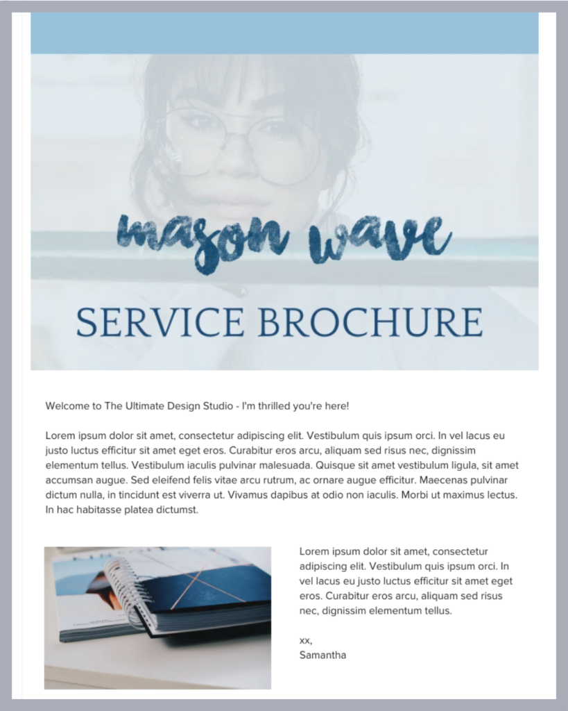
Inside a HoneyBook Brochure, you can add images as columns, section headers or cover photos. Kelli recommends adding at least one large cover photo and smaller photo headers for each section.
You can drop in branded assets such as your logo or illustrations that incorporate your brand colors and fonts. If you’re using the brochure to show examples, drop in a project sample as each section header. Within the sections, you can include a brief description of the project types. Your leads will love seeing and reading about your services!
2. Add Custom Fonts That Match Your Brand
The font you use can help make a seamless experience between your website and your brochure. Font choice is also important for accessibility so you can ensure your content is readable.
Within HoneyBook, you can choose from more than 50 commonly used font types. Even if you don’t see your exact brand font, you can choose one that matches it closely.
3. Include Your Brand Colors
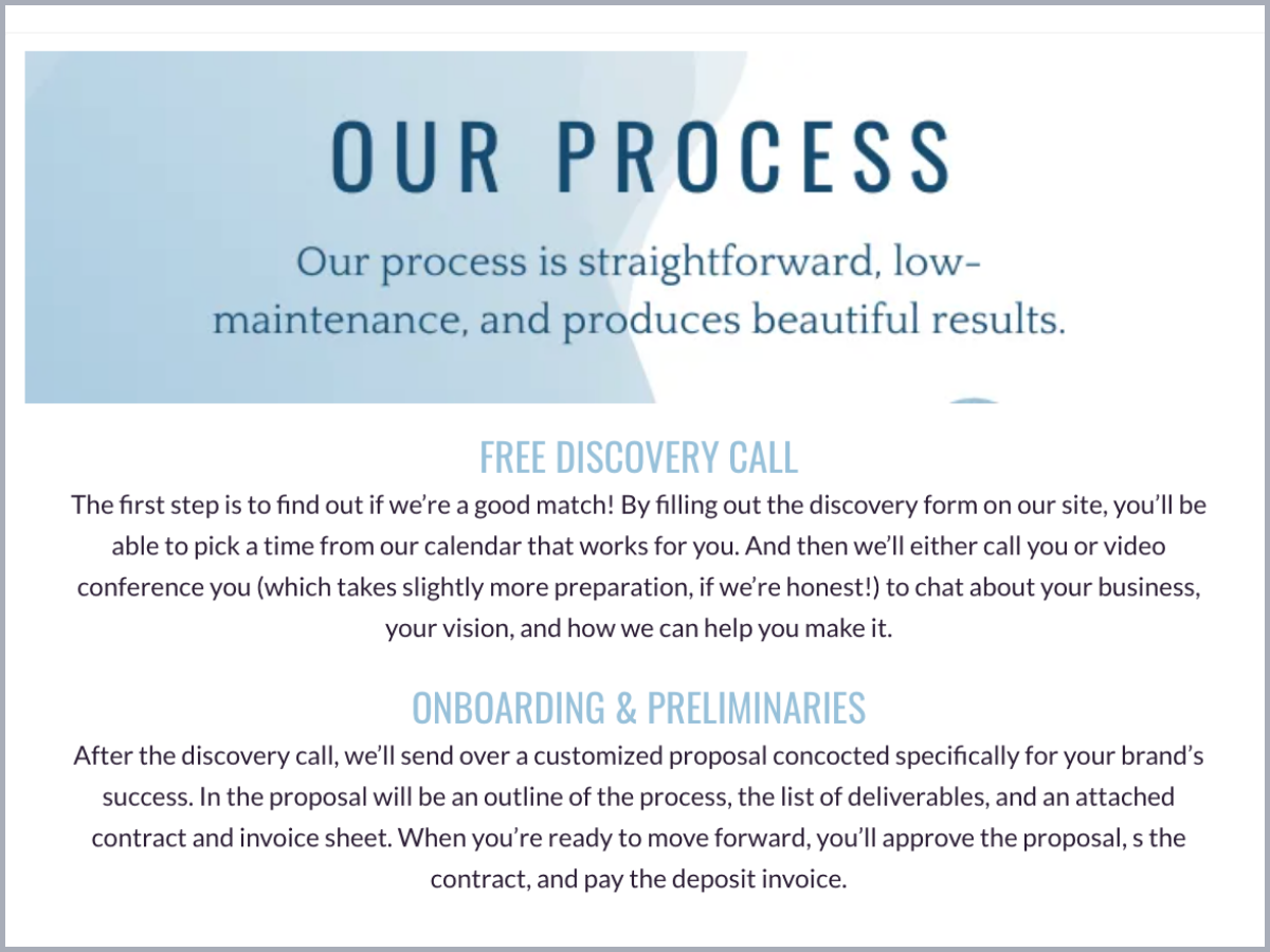
Among your images and fonts, be sure to incorporate your brand colors. You can drop in specific hex codes to change your font color so it matches exactly with the colors you use on your website. Try making your section headers your primary brand color and dropping in images that include a secondary color. Be sure to incorporate enough white space as well so your brochure is still clean and readable.
Use Your Branded Brochure to Convert Leads Into Clients
Incorporating your brand throughout a HoneyBook brochure is a great way to showcase your professionalism and authority. Clients will appreciate landing on your website, inquiring through a contact form and receiving a brochure that includes all the same brand elements. Consistency helps make your business more memorable, and your leads will be more likely to move forward with booking.
Use Kelly’s tips to create brochures that wow your leads. Get creative and consider all the ways you can use brochures, too. Introduce clients to yourself and your team and create brochures that offer ongoing education as well. You have the power to make the brochure work best for you!
Learn more about our HoneyBook Pros for more business and HoneyBook support! Including Kelli, our Pros are industry experts that can help you with everything from designing templates (like brochures or online contract templates) to developing your unique brand. Browse between different business categories and find the Pro who offers services you need.
Work With a Pro to Create Branded Templates
Wow your clients with a professional brochure and more. Connect with our HoneyBook Pros!
Contact Kelli