It’s always a good time to consider how accessible your client experience is. Use these 8 accessibility best practices to improve accessibility for your clients and prospects.

When was the last time you audited your business for accessibility? It could be that you’ve never assessed your client experience for accessibility. The good news: It’s never too late to optimize your processes and make them accessible to as many people as possible.
Creating an inclusive client experience means making information available to everyone—regardless of age, race, ethnicity, gender, disability, and more—in a way that they can access. To provide an equal experience to people with disabilities, you should focus on your online accessibility.
Not only is online accessibility ethical, but it can greatly benefit your business. A more accessible experience can bring in more clients and you can even benefit from ADA (Americans with Disabilities Act)-compliant incentives like tax credits.
In short, online accessibility increases the number of people who can comfortably access information and materials. If we create websites and client materials that aren’t accessible, we’re offering a poor experience to the one in four U.S. adults who live with some form of disability.
What are the 8 accessibility best practices?
The eight accessibility best practices are:
- Check your color contrast
- Choose readable typography
- Use clear formatting
- Use accessible language
- Avoid directional language
- Be consistent
- Add alt text to images when relevant
- Optimize video for accessibility
Who is accessibility for?
Accessibility initiatives aim to improve the experience for anyone with a disability, whether it’s:
- Visual
- Auditory
- Physical
- Speech-related
- Cognitive
- Neurological
When accessibility comes to mind, you may think of people who are blind and need auditory options, as well as people who are deaf and require visual options.
But, many other disabilities benefit from accessibility:
- Dyslexia: Crowded letters and content can make it more difficult for people with dyslexia to read
- Epilepsy: Animations and GIFs that flicker can trigger photosensitive epilepsy
- Color blindness: Though there are different types of color blindness, the most common type makes red and green indistinguishable, so certain graphics and photos can be hard to understand
- Loss of or absence of mobility: Moving a mouse and using a keyboard can become difficult and require a screen reader
There are also situational limitations where someone would benefit from accessibility. Some of these include working with a broken arm, with poor lighting, in a noisy area, lack of access to audio, or using a mobile device with a small screen.
Accessibility circumstances can affect all of us. Accessibility initiatives can create a client experience when implemented correctly.
Instead of thinking about accessibility as something to “add” to your website design and client experience, it should be core to your processes for updating your website, sending files, and more.
Learn more about building an inclusive business.
Download our free guide to learn more about conducting inclusivity audits and making inclusivity and accessibility core to your business.
1. Use contrasting colors
Light text on a light background is hard for everyone to read. But, for those with visual impairments, these combinations may make reading impossible. As a rule of thumb, use high-contrast colors to make sure everything is easily readable. Check out some examples.
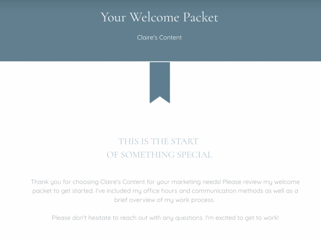
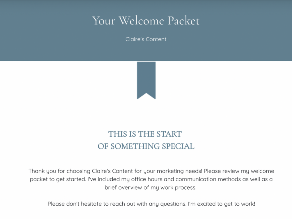
When incorporating your brand colors on your website or within your files, consider where they’ll best take into account accessibility considerations.
Pro tip
Check out Contrast Checker online and see if your color combinations pass the test.
It’s always a good idea to include your logo and your primary colors might look great as the background for your CTA (call to action) buttons. But, the rest of your file may be best as standard black text on a white background. Often, simplicity is best for accessibility.
2. Choose readable typography
Similar to your brand colors, consider if your brand fonts are accessible. Script fonts can be especially difficult for clients with visual impairments, including aging eyesight. Any font that makes each letter hard to read is also inaccessible to people who aren’t as familiar with the English alphabet.
If you want to choose unique brand typography, we recommend selecting a few options you could use for advertising or social media. For your client-facing files and website materials, it’s best to use a standard serif or, better yet, sans-serif typeface.
3. Use clear formatting
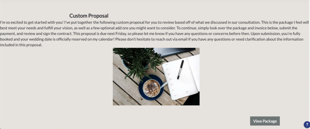
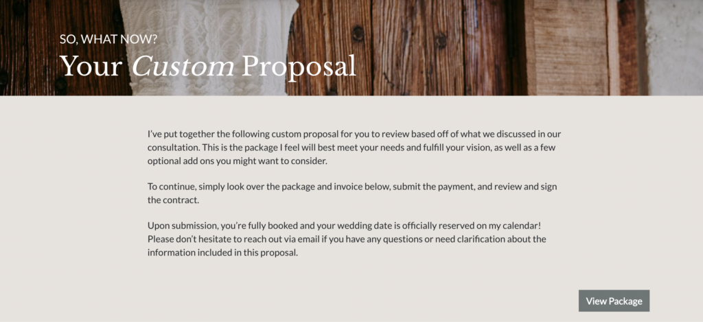
Another factor in readability is formatting. Imagine receiving a proposal file that includes one huge block of text with an image placed somewhere in the middle. Regardless of disability, it would be difficult for anyone to pick out important information quickly.
Here’s what can you do to make your content easier to read:
- Break your text into smaller paragraphs—it makes it easier to pick out and absorb important content and steps to follow
- Add wider top/bottom and right/left margins
- Add padding (space) around elements/images
4. Use accessible language
When it’s time to write content for your client files, keep in mind your clients’ range of needs. Some clients may have a cognitive disability that makes reading difficult, while others may not speak English as their first language.
If you have a brand voice, use it in your messaging. Casual, everyday speech should be understood by most, but mix in too many uncommon euphemisms or sayings and your clients could lose your drift, uh, I mean, not get your message. In fact, it’s best to aim your writing at Grade 6–8 reading level. This will accommodate most people and make your content quick and easy to read.
Pro tip
Tools like Hemmingway Editor are free and can help you grade the readability of what you write. Hemmingway Editor literally tells you what grade level you’re writing at.
Never assume what your client knows. Something you say every day could be something they’ve never heard before, so you may need to explain what you mean or omit them altogether.
5. Avoid directional language
When you’re creating accessible content, consider all the ways people can consume that content. For instance, people with visual impairments may use screen readers to understand what’s on a page.
With screen readers, your clients will hear all the text in a file read aloud. If you have CTA buttons that say things like Click Here and Learn More or Go to the menu on the right, it won’t mean much to clients who can’t see what that language is referring to.
This directional language can make the experience difficult for people using screen readers. Instead, make your link and button text descriptive. It doesn’t need to be long, but it should refer to the action.
For example, you can put Next Page on your buttons for clients filling out your files. When you use text links, always reference the linked page, e.g., rather than writing Click Here, write Go to purchase page.
6. Be consistent
Another best practice for accessibility is being consistent. This helps avoid confusing situations for your clients and it can also make your job easier.
If you send a file that uses the language Next Page on one button and Next Step on another, it can be confusing for people with screen readers (and everyone else). As people, we tend to look for patterns and inconsistencies, and finding them can throw us off.
Using a variety of file layouts, headers, and element designs can be confusing. Additionally, differing styles can make your brand look less professional and put together. To make it easier on your clients, choose the same wording for your CTA buttons and use file templates that you can simply and easily personalize for each client, without affecting the consistency.
7. Add alt text to images
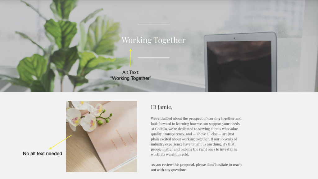
For clients who use screen readers, using alt text is important to give them an equal understanding of a file or page. If an image has embedded text, for instance, the alt text should include the message.
When implementing alt text, only describe images that impact understanding. If the image is offering more context or value to the file, that’s when alt text is important. Otherwise, don’t waste a client’s time by describing an image that’s only decorative.
8. Optimize video for accessibility
If you use video on a website or include it in your smart files, consider clients with auditory impairments. You should always offer a transcript and closed captioning of the video so they can read it as the video is playing.
Also, consider people with visual impairments or cognitive challenges like ADHD and dyslexia. In these cases, videos with clear audio are especially important for clearly conveying your message.
Make accessibility best practices a priority
The next time you’re updating your website or creating new client files, think about accessibility best practices—and make it a priority. There’s plenty to learn, so continue educating yourself and use this knowledge to improve the client experience and your business!
There are many resources available to help you, such as contrast checkers that check for WCAG compliance (Web Content Accessibility Guidelines) and the Web Accessibility Initiative’s checklist for web accessibility. With these accessibility best practices, you can make your client files accessible and build a more inclusive client experience.
Use accessible files every time with HoneyBook.
With HoneyBook, you can implement accessible branding for every file you send.
Our templates also allow you to create consistency for every client and build a process that prioritizes accessibility.

