These brochure design best practices can help you land more clients by making sure your sales brochures are clear, effective, and professional! Create a beautiful brochure to send to leads and clients.

Brochures are an essential tool for promoting your small business. Once your leads are in the consideration phase (they’re interested in booking with you), a brochure can help you seal the deal with more information about services, pricing, and success stories.
Though it sounds straightforward, the truth is many brochures fall short. Many lack the secret to actually help you grow your business: making it easy for an inquiry to book you. And that’s the whole point of sending a brochure, right? To get booked, again and again.
By following a few brochure design best practices, you can communicate directly to your target market and get them to choose your product or service.
Jump to:
- Use a professional template
- Incorporate your branding
- Show and tell using testimonials
- Add a personalized touch
- Make it easy for clients to book
- Bonus brochure design tips
- How to use sales brochures
Get a competitive edge when presenting your services.
1. Use a professional template
Let’s face it: we aren’t all well-equipped to design a brochure. That’s okay! Using a professional template that you can customize is one of the best and easiest ways to produce a high-quality brochure.
Whether you find a template or create your own, it’s important to choose one that helps you create a beautifully designed handout. You’ve got a captive audience that’s interested in what you have to offer. And now is the time to present them with a high-impact piece that presents your services, pricing, and story in the best possible light.
Need help finding the right template?
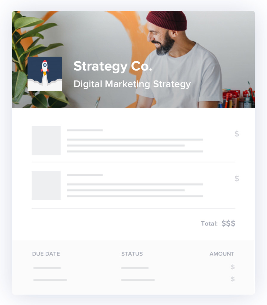
HoneyBook’s brochure templates are professionally designed and 100% customizable, allowing you to put your brand front and center. Switch out the images to make them your own or use them as is to get started–fast. Or, for full creative control, start from scratch using HoneyBook’s layouts.

Pro Tip: Our brochure templates are also great for building out and sharing all kinds of important information with your clients at any point during your clientflow.You can send welcome packets, guides to working with you, design proofs, proposals, service catalogs, your portfolio, and more.
2. Incorporate your branding
Consistent branding is key to building customer trust, brand awareness, and affinity. Your brochure should match your brand’s look and feel by using your logo, colors, imagery, and voice.
Think about all the steps your leads will go through before they see your brochure. They might find you through your website or social media. Even if they reach out from a word-of-mouth referral, they’re likely doing some initial research online.
You want your brochure design to stay consistent with the other places they’re seeing your brand. That way, they can create a connection and understand that your brand is professional and authentic.
3. Show and tell using testimonials
Of course, showing your inquiries why they should work with you by including visuals of your best work is important. But don’t forget to say it, too. Testimonials from previous clients can reinforce your messaging and your brand’s value, helping you to seal the deal.
Inside your brochure, include examples of previous projects (if applicable) as well as quotes from previous clients. Your testimonials can include photos from events, graphic design samples, or even just smiling client photos– it all depends on what’s relevant to your business and services.
4. Add a personalized touch
The best part about using a brochure template is that you have something to start with. It doesn’t mean you should send the same version to every client.
Instead, alter the template to highlight services, imagery, and reviews related to what you know each client is interested in. It shows you’re paying attention to who they are and their needs and interests, helping you build a personal connection–and increasing your chances of getting booked. According to an Epsilon research report, 80% of consumers are more likely to make a purchase when brands offer personalized experiences.

Pro tip: The contact form on your website is a treasure trove to help you personalize your brochure. Pull from obvious fields like name and services they’re interested in, and have fun including information from fields like “how did you hear about us?” For example, if your inquiry heard about you through a past client, you can share a favorite memory and photo from that project.
5. Make it easy for clients to book
If you’re only going to follow one brochure best practice, this is it: Let customers book from your brochure with the click of a button.
Gone are the days of paper fold brochures that are too easily lost or forgotten. These days, you can easily send a digital, branded brochure that offers a seamless experience from service selection to booking and payment.
The second you make your inquiry click out of your brochure to take another step to contact you, request a proposal, or book your services, the second you’re less likely to get booked. Customers get distracted. Emails get buried. The less friction in the process to book you, the better.
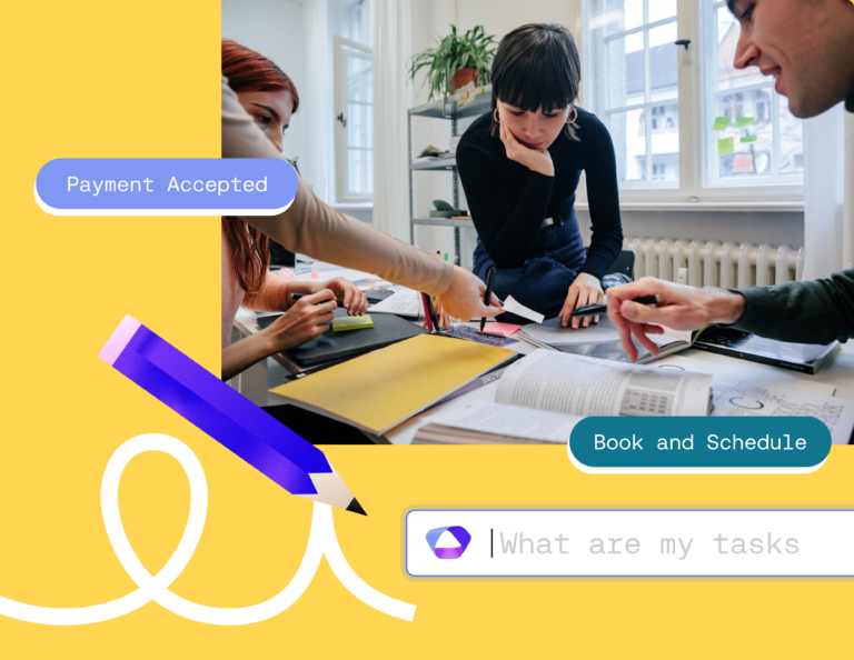
With HoneyBook brochures, your customers can book faster with clickable fields that let them choose their desired services. They can even build their own package using the a la carte feature. After a customer submits the brochure, you’ll get a notification and a proposal is automatically generated for you. Just review, hit send, and get booked within minutes.
Bonus brochure design tips
People form as much as 75% of their opinion about a website’s credibility based on design alone, and the same stands for brochures! If the brochure looks unprofessional, or if it’s too hard to read and use, you’ll lose potential clients. Use some of these bonus design tips to keep your brochures fresh and appealing:
- Always use white space – let your blocks of text and images breathe by giving them enough space in between.
- Use graphic design to enhance your branding. Simple illustrations and custom graphics will resonate better than stock photos.
- Don’t forget your font! Some business owners think their visual brand is all about imagery, but they forget font matters too. Use a custom font throughout and different colors for headers.
- Make your brochure accessible. Follow best practices for digital font size to make sure your copy is readable, and pay attention to contrast. Avoid light text on a light background.
- Don’t forget a header. You might be tempted to jump right into your content and services, but your clients will appreciate a smooth transition with a clear label for your brochure.
How to use sales brochures
Using marketing and sales brochures is all dependent on business owners’ individual clientflows. Some owners might wish to use brochures as digital business cards–sending them as an introduction to any client who inquires. Others might wish to save them for leads who get further down in their pipeline and use them as a booking tool.
We recommend mapping out your client journey and process first to determine where a sales brochure fits best. From there, you’ll be using it to its full potential.
Share, get booked, repeat
It’s time you got more out of your tried-and-true marketing brochure. By following these best practices, including allowing clients to book you right from your brochure, you can convert more inquiries to actual clients.
